What were they thinking?

Posted: December 9, 2009 | Categories: Mobile Development, What Were They Thinking
For our Lotusphere presentation in January, Rob Wunderlich and I started talking about how to approach our topic about mobile web development. One of the things that came up was an agreement that a lot of developers, while they know all about web development, didn't think of the ramifications of their decisions as they mobilized their sites. Even though the mobile browser supports most of the web development standards, it doesn't mean you should make use of them. Also, even though you know how to build a site for a desktop browser, doesn't mean you should do the same thing for the mobile user.
We decided then that the underlying theme for our session was going to be 'What were they thinking' and in preparation for that I have started collecting examples of bad (bad, very bad) things that mobile developers do that makes life hard for mobile users. As I collect these things, I'll start posting them to the site and see where I can take this.
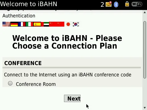
The first example for this series is is shown below. I am at a hotel attending some sales training (yep, I'm a sales guy now) provided by my employer and tried to connect to the hotel's wireless network to do some work. My BlackBerry Storm 9700 was smart enough to recognize that I was on a hotspot network, so immediately launched the hotspot browser so I could login to the access point before going on to do my work. When I looked at the page, I noticed something that I thought I'd share with you as the first rule in the 'what were they thinking' series.
Take a look at the following image:

The site gave me an easy way to select my language that didn't consume too much screen real estate (always a good thing). Imagine how much harder it would have been to use if there was a big list of languages or a drop-down list containing the list of supported languages?
Where the developer went wrong was in the way he (or she) used the radio button. Whenever you present a radio button to a mobile user and there's only one item in the list, you make them do extra work to select that tiny little button before clicking next. The smart developer will detect how many items there are in the list and either remove the choice all together or, if you're going to put a single item in a radio button list, pre-select the only available option. Don't make the user make the selection if there's no possible other option for them to use. It just doesn't make sense to make the user do that extra work when it's not necessary.
I'm a little older and I'm starting to have trouble reading mobile device screens without my glasses, so when I was first presented with this page I immediately clicked the next button and didn't think about the radio button.Of course the page errored out and I had to go back and pay close attention to what I was doing - but this wasn't a good use of my time.
If you're building a site like this, please think about the impact of these types of things on your user. There's no reason to force a selection when there's really nothing to select. Make sense? Implementing this in dynamic environments like PHP or Domino is really, really simple - just a simple if statement with two different HTML outputs depending on the number of options in the list.
Next Post: What Were They Thinking 2
Previous Post: Speaking at Lotusphere 2010
If this content helps you in some way, please consider buying me a coffee.