BlackBerry Development Tool Macintosh Installation Weirdness

Posted: October 21, 2011 | Categories: BlackBerry
I was excited to learn at BlackBerry DevCon 2011 that RIM had finally released the Macintosh versions of their development tools for BlackBerry and Playbook development. Having a MacBook in my hotel room (my Windows Laptop died ore than a week ago) I downloaded the code and tried to install it. I noticed some weirdness with the tool installation, so I thought I'd write about my experiences here.
The tools download as a zip file, a different zip file for BlackBerry vs. Playbook development. That's not that big of a deal, except the zip files contain an application installer with EXACTLY the same name. Instead of naming the packager within each zip file with a name appropriate for the particular installer, they named them both the same and it causes problems. Take a look at Figure 1, you'll see the two zip files (with separate file names) but then two applications, both with the same name (although the second one has a 2 after it's file name).

Figure 1
How do you tell which one is which? You can tell by the file sizes (very different between BlackBerry and Playbook), but you shouldn't have to – especially since the Macintosh Finder doesn't render files in this layout by default. RIM should have thought of this scenario and named the installers better.
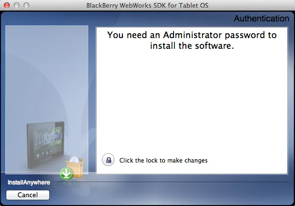
OK, when I got around to installing the tools, I came across something I'd never seen before on a Macintosh. Take a look at Figure 2, it shows the first screen you see when installing the tools. When I first saw this message, I had absolutely no idea what to do with the information. I knew that Windows would allow me to run an installer as an Administrator, but had no idea how to do that on a Macintosh.

Figure 2
I closed the installer and poked around to see if I could figure out how to run the application as an Administrator. I couldn't find anything, so I just launched the installer again. I stared at the screen for a while then decided that the only option available to me was to click the lock icon and see what happened.
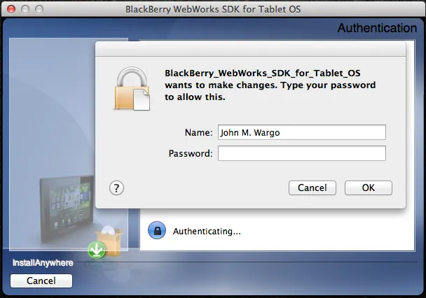
Guess what? It prompted me for the Administrator's (me) password as shown in Figure 3 and proceeded to perform the installation.

Figure 3
What concerns me though is why I had to go through that? Why didn't the install just progress and leverage the feature of the Macintosh that prompts me for the password? That stupid little lock icon didn't make sense, nor did the prompt that apparently was trying to tell me that I needed to click the lock icon to get past this particular issue.
I've said this before, if there's only one option available to me, why not just click it for me automatically? Why make me click it when there's really nothing else I can do? Why doesn't the installer provide a message that tells me I need an Administrator password then politely let me know I can enter said password by clicking the lock icon? There was absolutely no way for me to know, based upon the information provided me, that the lock icon allowed me to enter the Administrator password. Why put the lock icon, the only thing I can and should click as far away as possible from the message warning me that I needed to click the icon?
It's almost like they really don't want me to install the tools. Ugh!
Next Post: What Were They Thinking 11
Previous Post: BlackBerry DevCon 2011 Days 2 and 3
If this content helps you in some way, please consider buying me a coffee.