What Were They Thinking 10

Posted: October 20, 2011 | Categories: Mobile Development, What Were They Thinking
In preparation for BlackBerry DevCon 2011, RIM released this year's version of the DevCon mobile application. I've written here about this application and the BlackBerry World (WES) conference applications over the years and I've never been quite happy with the applications. I've always felt that the applications were hard to use and included features that just weren't needed in an application like this. My belief was that RIM focused too much on making a flashy, showcase application instead of focusing in an application that got the job done as efficiently as possible.
This year's BlackBerry World and DevCon applications were different. They are highly useful, efficient and got the job done. Gone were the fancy background graphics that made the menus difficult to read and gone too were those ridiculous page transitions that took so much time to get you from one screen to another. This year's DevCon application just works and I found myself actually using it for a change rather than using the desktop web version and downloading session information into my calendar.
It looks and feels like the application is a BlackBerry WebWorks application. It shouldn't be possible to tell, but for some reason I just 'know' it's a WebWorks application. The cool thing is that because it's a WebWorks application, it was very easy for RIM to make it available for both BlackBerry and Playbook devices. That's a great testament to the application direction RIM has taken.
There were some problems with the application though, and that's why this particular post made it into the What Were They Thinking category. In this case though, I'm really not trying to complain here (as I usually do with this particular series), but instead to point out design or implementation decisions that were made that probably should have been made differently.
Let me show you what I mean:
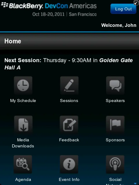
When looking at the application home screen shown in Figure 1, it's really hard to tell that the icons shown there are clickable. They look like they're disabled. They use color for the logout button and the DevCon logo, but deliberately didn't use color to indicate clickable areas on the home screen. Those icons are dull and truly (to me) do not look like anything I should be able to click on.

Figure 1
As you will see later, other parts of the application are rich with color, but not the home screen icons. What were they thinking?
A neat new feature for this year's application was the ability to synchronize your event schedule with your BlackBerry calendar. Finally! For previous conferences, you could do your calendar on the desktop web and download them into a calendar program (Microsoft Outlook, IBM Lotus Notes and so on), but it was challenging to do it from the mobile application. With this year's application, synchronization is automatic and it's an excellent feature.
One thing I noticed though, and I probably wouldn't have noticed it except that it caused me a problem, was that the calendar appointments the application made for me were not marked as Busy on my calendar. One of the reasons I liked the calendar sync was that it updated my calendar so colleagues would see that I'm busy and not schedule appointments for me during those time slots. I had people trying to schedule me for meetings in time slots I knew I had blocked for sessions I was attending. It was only when I looked at some of the entries created by the program that I realized that even though the DevCon app made the appointments for me, it simply didn't make them the right way. What's the point of putting an item in my calendar but not marking my time as busy for that time slot? What were they thinking?
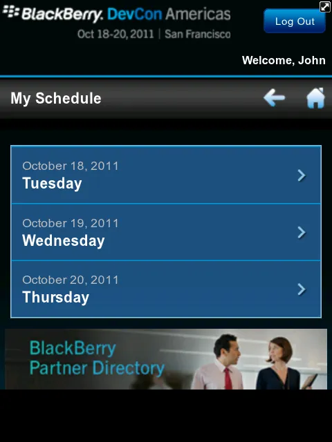
Another thing I noticed, and this is a HUGE pet peeve for me, is that when you open the agenda or my schedule, the application doesn't by default open the current day's schedule. The application knows what day it is and it knows I'm opening my schedule, why not default to opening the current day's schedule then give me options to select different days if I want? The designer of the application has to think about how the application will be used; in this case they didn't. 99% of the time I'm going to be looking at my current day's calendar, why not show it to me first instead of making me click the current day every single time I open that part of the application. I shouldn't have to make a selection on the screen shown in Figure 2 every single time I open that part of the application.

Figure 2
Open the current day's schedule no matter what then give me previous day and next day buttons on the top to use to get to a different day. It's only a three day conference, so it would never take more than two clicks to get to any day but only one click to get to the current day.
Another thing I noticed about Figure 2 is that it's impossible to tell that the BlackBerry Partner Directory image at the bottom of the page is a clickable item. I noticed by accident that it was there and clicked on it to see if it was clickable only to be surprised to see that it was. Why have an additional item on the page that breaks the theme of clickable items? In the UI, they have things that look clickable (the list of the event dates for example) and other things that are clickable, but don't look clickable. That's bad design. What were they thinking?
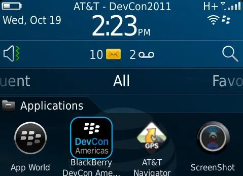
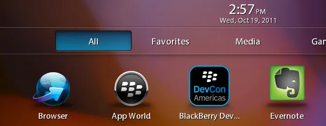
The next thing really surprised me since it's such a simple thing and it's pretty glaring. Take a look at Figures 3 and 4 below. Notice how much bigger the DevCon icon is compared to other icons on the BlackBerry and Playbook. The icon seems to match the 'theme' of the device or at least not look out of place against the other icons, but no effort was made to make the icon proportional to the other icons on the device.

Figure 3

Figure 4
How hard would it have been to make application icons that fit with the other icons on the device? As you can see from the BlackBerry Torch screen shot in Figure 3, the icon is so big that the icon and label scrunch up against each other.
For both examples, the application title is so long that it truncates. Why would you ever assign an application title that no matter what will always be truncated on any device it is installed on? It's clear that whoever created this application wasn't paying attention when they created the application icon and assigned the title for the application. They should have called the application DevCon 2011 and let the word 'Americas' in the icon indicate which version of the application was installed. Or, for people who would need multiple versions of the application installed (which would only be RIM employees and vendors, right) call the application DevCon Americas or something similar instead. Again, what were they thinking?
Next Post: BlackBerry DevCon 2011 Days 2 and 3
Previous Post: BlackBerry DevCon Day 1
If this content helps you in some way, please consider buying me a coffee.