What Were they Thinking 8 (part 2)

Posted: May 6, 2011 | Categories: Mobile Development, What Were They Thinking
A few hours after posting my article about the BlackBerry World conference application, RIM released an update to the program. I can't imagine what change would be so important to release an update to the application in the middle of a four day conference, but they did. Must have been a bug.
When I opened the application the first couple of times after installing the update, instead of the default 'please wait 2-3 minutes while the application loads' that I complained so much about, the application showed a blank screen (with a web browser cursor for some bizarre reason) for a really long time before opening. I imagine that it was somehow updating the existing data in the application or upgrading a local database, but it took a really long time without any indication on the screen what was happening. I even pulled the battery and tried again to see if I was having a problem with my device.
That's not good programming.
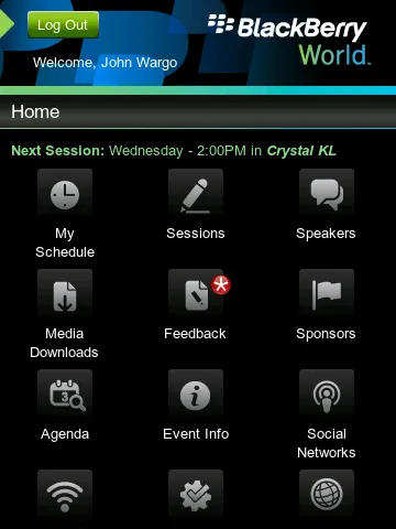
One of the things I noticed as I worked with the application was that the developer didn't make any accommodation for changing the orientation of the device. I use a BlackBerry Torch 9800, from AT&T of course, and it has a touch screen and slide out keyboard. I can change the orientation of the device and get better screen real estate for the browser and some applications. When you look at the application in portrait mode, you'll see something similar to what's shown in Figure 1.

Figure 1
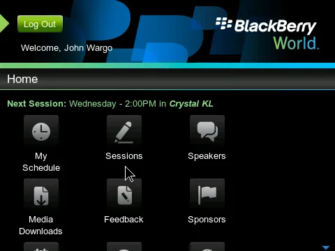
When you switch the device to landscape orientation, you'll see a screen similar to the one shown in Figure 2.

Figure 2
Notice that the screen doesn't orient itself to make full use of the screen real estate available when the device is in landscape orientation. This makes no sense to me. BlackBerry Device Software has API's that allow the developer to react to orientation changes since BlackBerry Device Software 4.7. These API's allow a developer to adjust the layout of their application's screens when the user rotates the device. The application clearly adjusts the header so it looks correct in this orientation, but why didn't they make it so the home screen options adjust their layout as well? What's the sense in making me scroll down to access the third row of icons when I have the room to fit at least two of them in that blank space to the right.
It's just sloppy programming – how could this have been missed? Did they expect that the user would never turn their BlackBerry touch-screen devices on their side?
Notice too that in Figure 2 you can see the pointer (the arrow cursor) on the screen. It's a touch screen device, why show non-touch screen controls when running on a touch screen device? Another example of sloppy programming. When touch is not available, that's a useful navigational element. On touch screens, in this case I've touched between icons to bring up the cursor, it's not needed. There's no need to show the cursor when I've touched the screen, I can't use my finger to move the cursor (not that I'd want to), so it should be turned off when running on this device.
It's RIM's app, they released it in support of their premier customer conference. They're spending a lot of time and money promoting their concept of Super Apps https://us.blackberry.com/developers/started/super_apps.jsp but when they release an app for their conference, the hire a developer that can't make accommodation for orientation changes or integration with the device calendar? That's sloppy, very sloppy.
Next Post: Gartner, MEAP and RIM
Previous Post: Multiple-login Smartphones
If this content helps you in some way, please consider buying me a coffee.