What Were They Thinking 9 (RIM Again)

Posted: July 13, 2011 | Categories: BlackBerry, What Were They Thinking
For a long time now, I've been running a series on mobile applications, highlighting where developers build an application for a mobile device without really paying attention to the mobile device or the needs of the mobile user. In this article, I'm going to shift gears and talk about something related to mobile, but not directly to mobile applications. I've written about this company many times before, let's take a look…
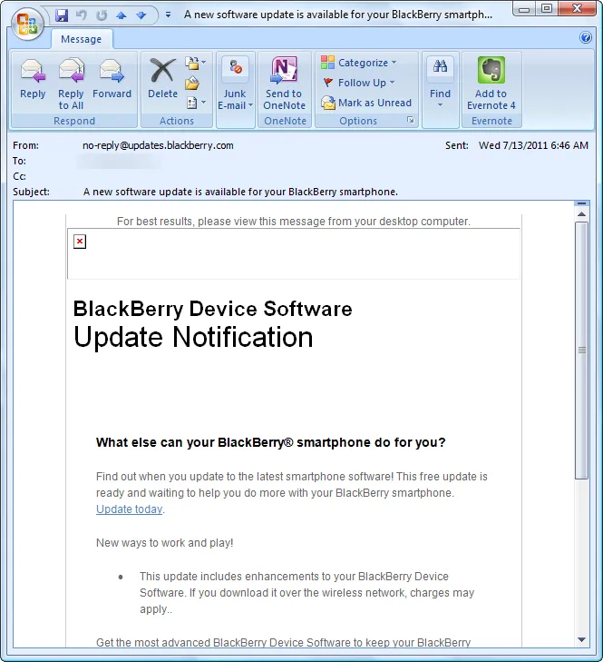
I received the following email this morning from Research In Motion. I'd signed up for updates, so they would notify me when new software was available for my device. I thought it was a good idea to keep my BlackBerry device up to date and it was great to receive the notification.

Figure 1
What struck me as odd was not that the image they'd included in the email didn't load, but instead that they included a note at the top of the message saying:
“For best results, please view this message from your desktop computer.”
Seriously? An email from Research In Motion with a suggestion that the email would look better on a desktop computer than on a BlackBerry? That makes absolutely no sense. I have a BlackBerry. They know with a pretty high level of certainty that I have a BlackBerry (since I signed up for BlackBerry software update notifications, didn't I?). This makes absolutely no sense whatsoever.
What they did was format the message so it had a nice layout when opened in the desktop email client. It was designed to center the message's content in the center of the available space in the email client. Big deal, what's the point? I don't need emails content such as this centered in the email. It's a simple message letting me know that there's a software update for my BlackBerry device, does it really matter what it looks like? All they did was make it so the message was larger than it needed to be (all of that HTML content used to make the message formatter better on the screen), took longer to download than necessary and costs the receiving company (my employer) additional cost (over text-only messages) to store and forward the message to me.
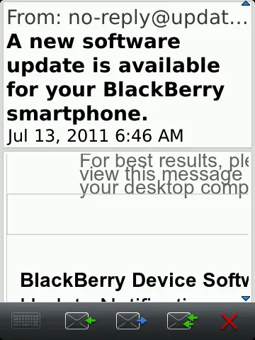
Here's what the message looked like on my BlackBerry:

Figure 2
Yes, I have my fonts cranked up (I'm old), so it's bigger that it would be on your device. The image at the top of the message doesn't appear on my BlackBerry device either, so I'm not sure what's going on there.
What I needed was a simple, text-based email from Research In Motion letting me know there was new software available for my BlackBerry device. I needed to know it was available, how to load it and what is different in the new version (what's new, what's been fixed). I didn't get that. What were they thinking?
We need to get back to simple. Use HTML formatted email where it matters – not in simple emails like this. If you know the reader is likely to be reading the email on a smartphone, format the message so it looks OK in both the desktop and smartphone email clients. A message to a BlackBerry user with information about his or her BlackBerry device should be formatted expecting that the message will be opened on a BlackBerry. It makes no sense to do anything else.
Next Post: Can't Speak at BlackBerry DevCon
Previous Post: On the Open Letter to RIM
If this content helps you in some way, please consider buying me a coffee.