
Mobile on WordPress

Posted: December 3, 2012 | Categories: Mobile Development
I've been doing a lot of work in WordPress lately. I've always been a fan of the wildly popular, Open Source Content Management System (CMS) but I've always thought it was more appropriate for web logs (blogs) than company web sites. Of course, many companies use WordPress for their web sites, and there are even commercial offerings for business customers, so I know it's common to find business uses for WordPress.
This summer I worked with some neighbors who were opening a boutique olive oil and balsamic vinegar store in South Charlotte called Olive This! (www.olivethis.com). As I consulted them about what they wanted to accomplish and their potential skill set, it was clear that WordPress was the way to go for them. I quickly setup a site, populated some menus and got them going. It wasn't long before they took over the site and now it's truly a thing of beauty. My only involvement going forward is to provide some occasional support when something weird happens or when they want to add something new to the site and don't know how.
For many years I've had a personal, family web site (different from this, my technical blog site). I first set it up when I was learning Joomla and made a Joomla site for the home page. Over time, I picked up WordPress and added it as a sort of blog underneath the Joomla site. Of course, it didn't take me long to figure out that what I'd done was pretty stupid, having two CMS running essentially the same site made no sense. Unfortunately, it wasn't until years later (just about a week or so ago) that I decided to whack the Joomla site and move everything to the WordPress site. I did that and I'm really happy with the new site. It's clean, simple and does exactly what I need it to do.
For many years, since the late 1980's actually, I've had this side company called McNelly SoftWorks www.mcnellysoftworks.com. Over the years, I've assigned all of my copyrights to the company and done any side work under the company's name. Back in 2005, after I sold my shares in a Northeastern Ohio-based software and consulting firm, I ran McNelly SoftWorks as a full-time business and even created several commercial software products that are still available for sale today. About that time, I created a web site for the company using NetObjects Fusion – a web site generator that at the time was pretty interesting and cool (to me).
One of the long-term items on my to-do list though was to migrate the company's static web site I created using NetObjects Fusion to something more dynamic. I originally thought I'd create it using Joomla (www.joomla.org) or perhaps Concrete5 (https://www.concrete5.org), but never got around to doing anything with it. Last week I finally got around to doing something with the site and I'm very happy with the results. The coolest thing, and the primary reason for this post, is that everything I did for the site was automatically mobile device friendly – simply because of the tools I selected to create the site.
Let me explain what I mean…
Figure 1 shows the new McNelly SoftWorks web site I launched this weekend. The site was created using WordPress and a very simple and clean template I found called Tiga (https://wordpress.org/extend/themes/tiga).
As I setup the site, I wanted the company logo and a simple menu at the top and the content filling most of the rest of the page. For the products area, I added a sub-menu which I was very easily able to assign to the right column of the page with the article content listed on the left. Overall, I really loved the simplicity of the site and how clean the UI was. I worked Friday night and Saturday morning on the site and was very happy with the results.
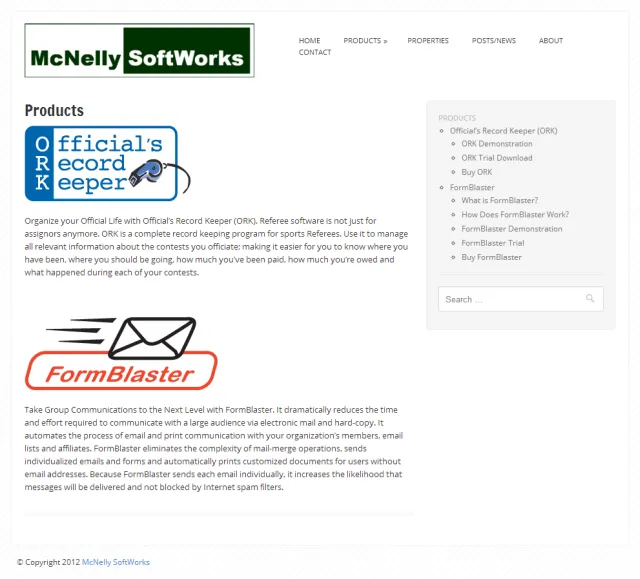
Figure 1 – McNelly SoftWorks web site
My son had a cub scouts meeting on Friday and as I waited for his meeting to wrap-up I fired up my BlackBerry browser to see how the site looked on the device's smaller screen. I was very surprised to see that the site was completely mobile friendly and looked amazing on the BlackBerry. Looking back, I noticed that the Tiga template was listed as being mobile friendly – I'd completely missed that when I selected it. Figure 2 shows the site on my BlackBerry Bold 9930 device browser.

Figure 2 – McNelly SoftWorks Home Page on the BlackBerry Browser
On the BlackBerry side, the BES or BIS services pre-process the web content automatically to make it better fit on the smaller BlackBerry screen. In this case, the BES or BIS Service resizes images to fit the screen. That capability coupled with specific settings on the Tiga template made the site simply render beautifully on the BlackBerry. Notice in the figure that the logo has been resized to fit the screen and that the menu is shifted from the right side of the page to directly below the logo.
When you open the products page shown in Figure 1, the 'side' menu gets added, but because of the limited real estate on the BlackBerry screen, it's shifted by the template to immediately below the page content as shown in Figure 3.
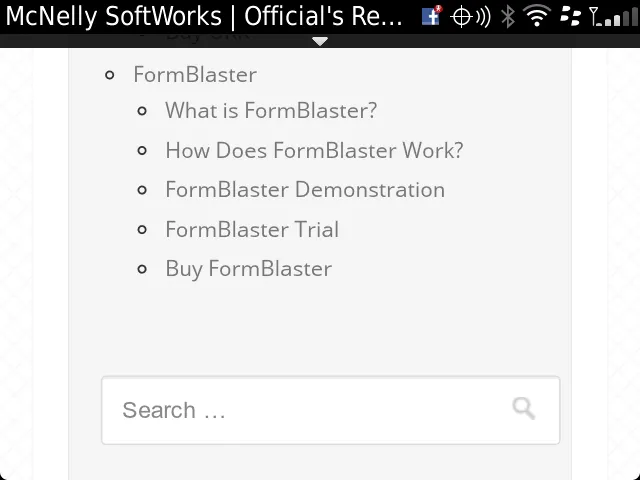
Figure 3 – McNelly SoftWorks Products Menu on the BlackBerry Browser
I tested every aspect of the site on the BlackBerry and it works great – what an excellent way to have both desktop and mobile friendly sites from a single template (without having to resort to the WordPress mobile Plug-in https://wordpress.org/extend/plugins/wordpress-mobile-pack/).
For those who would like to see the site on an Android device, take a look at Figure 4.
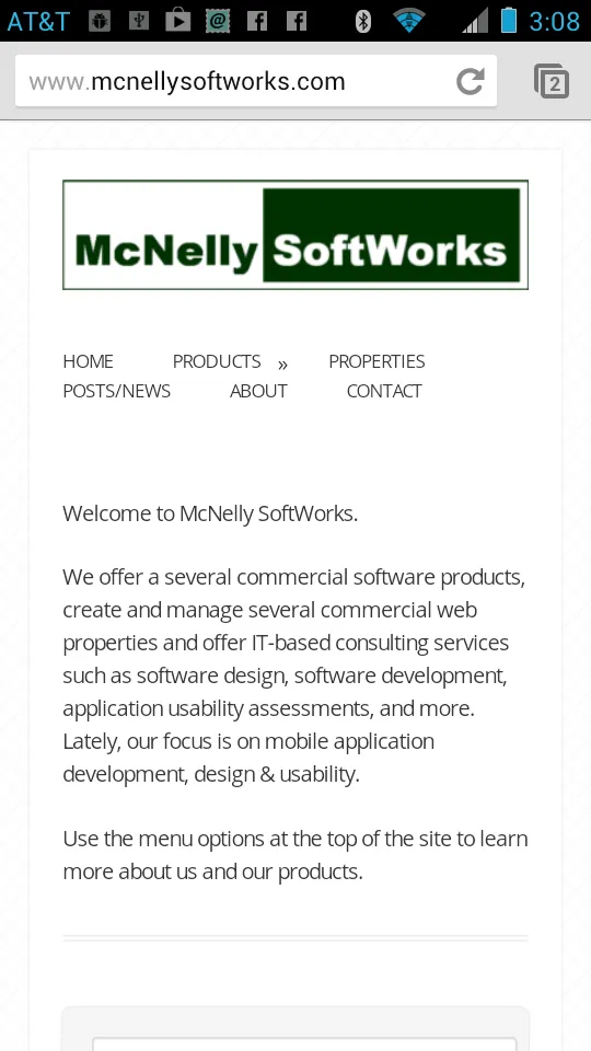
Figure 4 – McNelly SoftWorks Products Menu on an Android Device
On an Android Tablet (Nexus 7 in this case), the site looks like what's shown in Figure 5.
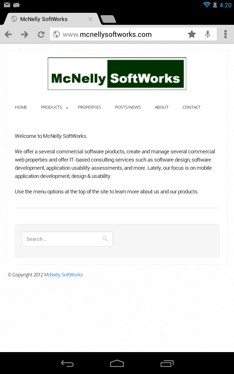
Figure 5 – McNelly SoftWorks Products Menu on an Android Tablet
And, of course, for those of you who have to see this on an iOS device, Figure 4 covers that option.
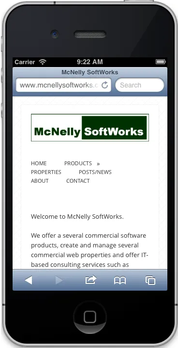
Figure 6 – McNelly SoftWorks Products Menu on an iOS Device
Notice that the Android device (my personal Motorola Atrix 2 device) does a slightly better job rendering the content. I've always generally felt that Safari is basically a desktop browser running on a smaller screen where the BlackBerry and likely Android browsers are actual mobile browsers. The site's menu looks much better on the Android device.
Anyway, the point of this article was to highlight how I was able to create a mobile friendly WordPress site without doing anything mobile-specific.
Next Post: Spain's Secret Strike
Previous Post: SAP CodeTalk Series
If this content helps you in some way, please consider buying me a coffee.