Email Message Layout Revisited

Posted: October 16, 2013 | Categories: Mobile
A while back, I complained about how email marketers weren't taking mobile devices into account when formatting blast emails. They were sending HTML-formatted messages and using CSS to style the emails like they wanted to, but those emails simply didn't render correctly on devices with smaller screens (like the keyboarded BlackBerry devices).
I know that the people creating these emails were taking mobile devices into account, they'd have to as many people nowadays don't even have PCs anymore, but where I think they fail is in accommodating all types of mobile devices.
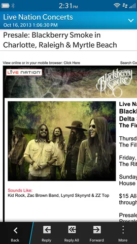
I received a couple of emails today which made me think about this topic. The one shown in Figure 1 below is what started me thinking about this. Notice how the content goes off the right side of the screen.

In my previous post, I was complaining mostly because the emails I received were centered rather than flush left in the email, so no matter what the device, anything with a screen more narrow than the width of the email would see a lot of blank left border for the email. With the example above, at least they flushed the content left so I wasn't looking at a bunch of blank space on the left with content beginning more toward the center of the screen. It's still not readable, but at least no screen real estate is wasted.
That was my point of my previous post – don't waste screen space by unnecessarily centering things. Several people misunderstood my point.
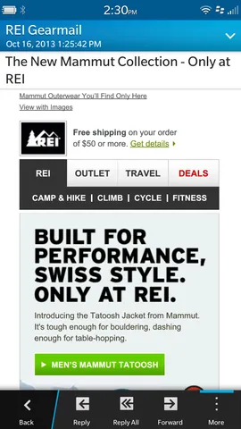
REI on the other hand, paid special attention to what they did and sent me the email shown in Figure 2 below. Notice how the email renders beautifully? They centered the content, but at least at the same time made sure that they didn't go past the right margin either.

That's the way to do HTML emails to mobile devices. Deliver an exceptional experience no matter what client is viewing the email.
Next Post: Chinese Translation of PhoneGap Essentials
Previous Post: BlackBerry Z30 Mail UI
If this content helps you in some way, please consider buying me a coffee.
Header image: Photo by Eirik Solheim on Unsplash.