Withings – Useless Input form

Posted: August 22, 2016 | Categories: Stupid Developer Tricks
I use the Withings (https://www.withings.com/us/en/) app to track my blood pressure and weight. I dropped a bunch of weight a few years ago and it helps me stay on track when I track it. My blood pressure has been wonky, so tracking that is a good thing as well. I'd like to get one of those scales and a Sphygmomanometer that automatically updates the app, but for now I'm doing it manually.
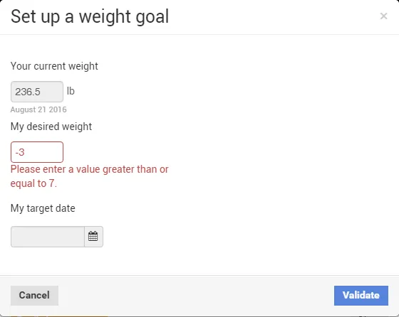
Every week or so, the Withings app sends me an email summary of my stats. In this morning's email, they offered me a chance to set a weight goal, and I quickly clicked on the link. After logging me in, I'm presented with the following form:

As you can see, it's asking me to set my goal (my desired weight). So, recognizing where my weight currently is, I decided that my goal should be 230 lbs. and I dutifully tried to enter that value. Apparently I can't do that.
You can't tell from the figure, but the input field is a spinner, with up and down arrows you can use to increase and decrease the value. For some bizarre reason, they've setup the form so those UI helpers disappear when the field loses focus. That's not helpful.
The form's asking me for my desired weight, and I'm trying to enter my desired weight, but it won't let me. I guess, I can't tell from any of the details on the form, they're asking me to enter a weight difference, not an actual weight target – but then how exactly is that a weight goal? By asking me for a weight difference, apparently I'm supposed to be entering a weight loss goal, not a weight goal. Sigh.
Notice too that the input field allows me to spin to a negative number; apparently the developer of this form didn't know about the HTML input field 'min' attribute (https://www.w3schools.com/tags/att_input_min.asp) that would have allowed him (or her) to restrict the input to only positive numbers.
Notice as well that I can only set a weight loss goal of 7 lbs. or greater. What if I only needed to lose 5 lbs., apparently I would not be able to set such a worthless goal using this form.
Input forms must be designed so the form's user knows exactly what is expected of them. The form's content should be updated so it's clear I'm setting a weight loss goal, not a weight goal. The input field should have its min attribute set so, first of all, the user can't set a negative weight loss goal, and so any positive value is acceptable. It's all fine and dandy that you want me to set goals of 7 lbs. or more, perhaps I have more reasonable expectations and know I can only lose 4 lbs. by a specific date.
Is the desired weight field required? You betcha it is. How about target date? Yep, that one is too. Do you see any visual indication that any of the fields on the form are required? That's another requirement – that users be able know clearly which fields they must populate to submit the form.
As I've proven, this form is completely useless and it was worth more effort than was needed for me to understand how to use the form. It's not rocket science folks, create input forms that are clear, succinct, well documented and easy to use. To do anything else is a waste of my time.
Next Post: Autostart Python App on Raspberry Pi in a Terminal Window
Previous Post: Doing Account Creation Right
If this content helps you in some way, please consider buying me a coffee.
Header image: Photo by Raspopova Marina on Unsplash.