NC Lottery App

Posted: December 11, 2018 | Categories: Stupid Developer Tricks
Don't tell anybody, but I buy lottery tickets; my wife says it's the only illogical thing about me, and she's probably right. I know in my heart that my chances of winning are only slightly higher when I play, but to retire early? Worth the few dollars per week.
I live in North Carolina (US), and the NC Education Lottery (yep, lotteries are all about the education, aren't they?) has a mobile app I can use to check my numbers. The problem is that the mobile app is so poorly designed that it's almost impossible to use for its intended purpose.
Let me show you the ways…
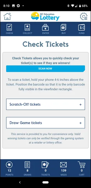
The app has a feature which allows me to check to see if my ticket is a winner. Unfortunately, the NC Lottery created two major issues that affect my ability to actually do that. For some bizarre reason, NC lottery tickets have two barcodes on them. One is for their Lucke Rewards Program (their typo in the name, not mine), and the other is so the vendor (and the app) can check to see if the ticket is a winner.

Note: I imagine the reason there are two barcodes on the ticket is because North Carolina is the only state that has the poorly named Lucke Rewards program, so there's no way for them to use the same barcode for both. Unfortunately, the barcode scanner on your phone (its camera) you'll use to check to see if your ticket is a winner can't read the barcode when there's two barcodes on the ticket. You can scan the top barcode (toward the middle of the ticket) to collect your rewards, but when you try to check to see if you're a winner, the scanner fails most every time.
To get around this, you have to cover the upper barcode with a piece of paper or cardboard before attempting a scan. How stupid is that?
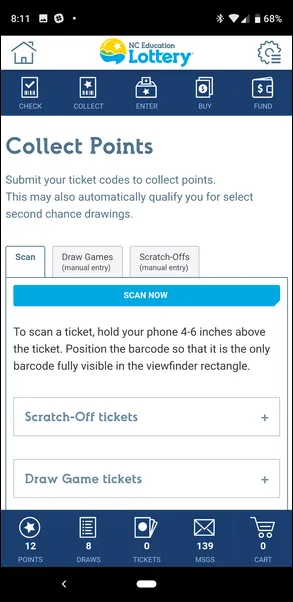
Notice the SCAN NOW button in the figure. It's a smartphone app screen, right? Notice how the button's too small to tap with your finger? The same is true for the collecting rewards section of the app as shown in the following figure. Poor design, not paying attention at all that users will be doing this on a smartphone.

The second major issue with the app is that the designer, or the development team that crafted the app didn't seem to consider the use case where a user needs to check more than one ticket at a time. They seemed to just assume you'd check a ticket every draw day, rather than collect them, and check them all at once.
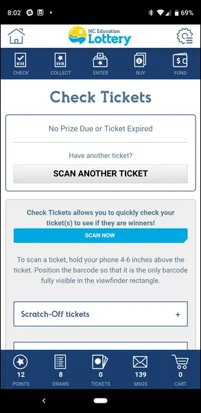
If you look at the results image below, you can see that the last ticket I checked was not a winner. Bummer, right? From a design standpoint, what's wrong here? Well, why do I need two buttons on the screen that both do the same thing?

Also, notice that the top button is finger-friendly. If the designer noticed that this button needed to be bigger so it can be easily tapped by a finger, why wasn't the same approach taken with the original button (which is still displayed)?
My real issue here though is that whomever coded this, doesn't clear the results area of the page when scanning another ticket. So, if I scan a losing ticket, then scan another losing ticket, there's no visual indicator that I've scanned a new ticket. The page doesn't clear or refresh, NOTHING changes on the results page between scans. Useless, absolutely useless.
If the ticket is a winner, confetti falls from the top of the screen and the results panel updates with the prize, so it's easy to see that the scan works. When scanning two losing tickets in sequence, there's no way for me to tell whether the app just failed scanning the second ticket. Designers and developers:
- Think through all use cases.
- Watch real users actually use your app
- Ask questions of people who don't already know how to use your app
The most interesting things I've learned from users is how they use tools in different ways than the tool (app) designer expected. That's one of the most interesting aspects of using Analytics tools to track how users use your app - you can sit in your office or cubicle and 'see' the path people take through your app. With that data in hand, make decisions on where to invest your efforts, or how to update your app designs to better accommodate your user's needs.
Next Post: What Happened to Commas in Numbers
Previous Post: Apache Cordova 3 Programming Site Retired
If this content helps you in some way, please consider buying me a coffee.
Header image: Photo by Raspopova Marina on Unsplash.