First App Store App

Posted: May 13, 2020 | Categories: Mobile Development
My first app in the Apple App Store was accepted by Apple today and published. The app is called Time Slicer, and the Android version of the app has been available for some time now.
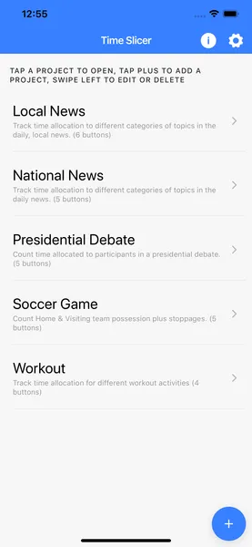
I describe Time Slicer as a Stopwatch with categories; it allows users to define projects where a project is basically a collection of categories you can track time across. Here's a screen shot of the iOS version of the app listing projects.

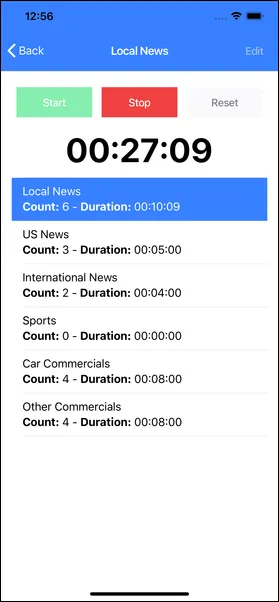
When you open a project, you see the list of categories and a simple stopwatch. Click the Start button to start the overall timer, the tap on any of the categories to track time for the selected category as shown in the following figure.

I made the app so I could look at a block of time, like the 30 minutes for a news show, and track how much time was allocated during that time for different categories. I could be wrong, but I believe it's the perfect tool to track time allocation for activities performed by the subject of a usability test.
Anyway, when I show app to people, the first thing they generally do is suggest additional categories or projects I can add to the app. This confuses me since that makes me think people think the app is pre-set with projects and categories. It's a mobile app, the data I show in the screenshots is sample data. Users of the app define as many (or as few) projects as they want for their particular needs and add the categories that make the most sense for the project.
I specifically added a tutorial to the app that walks you through the process so you can see that projects and categories are dynamic - they're whatever you want them to be. But I'm trying to figure out how to make this clear to users. Any ideas?
Next Post: Platform-Specific Links in Ionic
Previous Post: Pandemic Lockdown Fun
If this content helps you in some way, please consider buying me a coffee.